 Visual Monitoring with Alyvix
Designer: Component Tree
You can use Alyvix Designer to create selections on the screen. These graphical regions (images or GUI objects like boxes or text) are later matched against a live application interface by Alyvix Robot. Designer lets you combine selections and component options to create the components that make up a single test case step.
These components are not just a simple list, they’re hierarchically ordered in groups with restrictions between those groups. In Designer the components are displayed as the component tree, where there are three types:
A root element, which contains the screen capture that serves as the basis for the selections, and thus for later visually recognizing parts of the screen.
Groups, which indicate the principal components that needs to be recognized. A maximum of three groups can be created per test case object.
Components are the additional areas that can be used to confirm what is being recognized (especially when there are multiple similar target objects), such as a text label next to a button, or when the action can be on a separate GUI object, like a slider. A maximum of five components can be assigned to each group (including the main group element).
Structure of the Component Tree
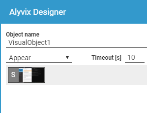
Alyvix Designer captures the entire screen to use as a basis for locating visual elements. This screen capture is represented in the component tree with the capital letter S as shown above. Initially, before you have added any components, this root element will have no children.
When first started, Designer will default to the first of the three available groups, indicated by the purple/red color. The three color sets (red, green and blue) are only intended to distinguish the three groups, and a group’s elements may in fact change color if you reorder or remove one.
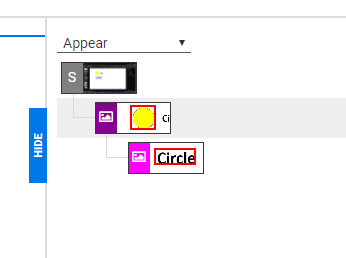
If you now create a selection, or a subselection with its corresponding region of interest, a thumbnail copy will appear in the component tree. A selection can stand alone as the head component of a group, or can be a “lower-level” component that depends on the head component and that inherits restrictions from it.
Each group or component is a single row consisting of an icon indicating its type (see below) and an image of the area around the object. Right-clicking on a row will display a menu of actions for that component.
Object Recognition Types
Alyvix’s visual recognition capability is based on two well-known open source systems:
The OpenCV computer vision project, which allows Alyvix to compare screen regions graphically
The Tesseract text recognition project, which lets Alyvix find writing in regions and convert it to computer-readable text, regardless of the font and font size used
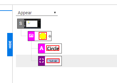
Alyvix uses these tools to visually detect three types of objects:
Image: Given a region of interest on the screen, Alyvix will look for the defined selection in that RoI. For instance, it may be a particular system or application icon, a shape like a circle regardless of its color, or a box that changes from one color to another. The “photograph” icon above represents an Image object.
Rectangle (Rect): Allows Alyvix to find buttons, boxes and windows that have a rectangular shape. The “bounding box” icon represents a Rect object.
Text: Looks for text near another located object. Because text recognition over the entire computer screen would require a significant amount of time, a text object cannot be the main component of a group. Alyvix will always look for text near the already-located main component. the letter “A” icon above represents a Text object.
Creating Groups and Components
When the Designer panel is not visible (you haven’t pressed the Escape key), the crosshairs show you where you can create a selection or subselection on the screen. The color will indicate which group any newly selected region will belong to.
You can change to a new group simply by pressing the number associated with it (1, 2 or 3) at which point the crosshairs will change to indicate the color of the new group. Designer will automatically switch to a new group after you add a fifth component.
If the component tree is empty, the first region you select will become the first group in the tree. As mentioned in the section Object Recognition Types, this region cannot be used for text recognition. If a group already exists and is selected, the new region will become a component in that group.
Warning
Although you can add up to five components per group, all components of all groups must be detected before any action(s) will be taken.
In addition to manually selecting the bounds of the region, you can right-click on any point on the screen and Alyvix will try to automatically determine autocontour the appropriate selection. You can also resize the bounding edges of any capture region by dragging them with the left mouse button.
If desired, you can continue to add components and new groups using the mouse and keyboard shortcuts without returning to the Designer panel.
At any point you can switch between selecting areas and the Designer panel. Use the Escape key to open the Designer panel, and the EDIT button at the bottom left corner of the panel to return to the screen capture.
Component Tree Actions
You can modify the component tree at any time by right clicking on a row, which displays a contextual menu showing you the available options (some actions will not be shown if they cannot be used given the current configuration of the tree).
Descriptions of these actions, along with their keyboard shortcuts, can be found in the table below.
Action |
Objects |
Shortcut |
Description |
New |
All objects |
CTRL + N |
Create a new component in the current group, in the next group if the current group is full, or a new group if no groups exist yet |
Remove |
All objects |
CTRL + X |
Remove the selected component, an entire group, or all groups at once if the root is selected |
Duplicate |
Group, Component |
CTRL + D |
Create a duplicate of the selected object if there is space available for more at that level |
Detect as Image |
Group, Component |
CTRL + I |
Change the object’s detection type to Image |
Detect as Rect |
Group, Component |
CTRL + R |
Change the object’s detection type to Rectangle |
Detect as Text |
Component |
CTRL + T |
Change the Component type to Text |
Set as Main |
Component |
CTRL + M |
Make the selected component the main group component (the component cannot be a text region) |